Back to the drawing board
For Netlife’s new illustration style, we invited all employees to join in.

Last year we worked on updating our own visual identity, and one of the things we needed was a richer illustration style. In Netlife we communicate a lot — both in projects and in workshops with our customers. In addition, we hold courses and lectures, and we blog regularly. Many of us are more text-oriented than visual heads, but we all need to communicate visually.
Back when we were still called Netlife Research, each employee received an (award-winning) illustrated “avatar”. These didn’t just give the employees and Netlife a shared identity which we saw that many appreciated, and was frequently mentioned as something new employees had looked forward to — it also gave us a diligently used illustration bank. The goal for the new illustration style was to achieve somewhat of the same effect as with the avatars, and at the same time deliver on our new brand strategy. In addition, the illustrations should be in line with the concept “for people, by people”, which Netlife’s visual identity is built on.
Process
The solution was to invite all employees into the process. Both to give ownership of the illustrations, but also so that everyone could contribute to solving their own illustration challenges. Our everyday work consists of many complex or abstract concepts, such as customer experience, clutter and chaos, the opposite of clutter and chaos — well-oiled machinery in a way, user friendly, prioritization and goal management. We needed a visual language for all of these.
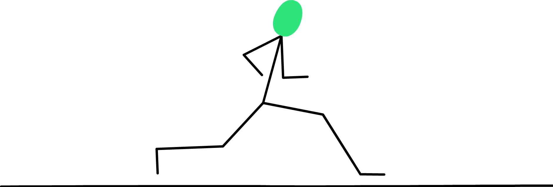
The first step was to arrange a drawing workshop, with a clear framework. One A3 sheet, equal black pens and a timer of 2 minutes. Everyone was invited: designers, developers, content heads, project managers, HR, sales and finance. Many who would initially say that they can’t draw. But give everyone a pen, paper and specific assignments and you’ll see that it will be good! Everyone was given two tasks: to draw something you like to do, or do a lot of in your free time and to draw something you like to do, or do a lot of at work.

We didn’t know what would come out of the workshop, but we do know our colleagues well enough to expect something good. The result was still beyond all expectations, both in terms of motifs and drawing style:

Before the drawing session, we had talked about different ways we could use the material, depending on what came out of the workshop. The next step was to digitize and redraw the drawings into a unified illustration style. We worked to keep the uniqueness of the drawings, while they should also appear as a consistent whole. And of course that they should fit in with the rest of the identity, where among other things the typography is an important element. Fine-tuning of stroke, use of color, etc. were important to achieve this.

Result
The result is a rich, entertaining and varied illustration bank. We wanted an overwhelming amount of choices, and the first batch consisted of more than 100 completed illustrations that can be used alone or combined almost indefinitely. A large and flexible toolbox that everyone has been involved in creating — it reflects the breadth of our people and allows for playfulness and varied metaphor usage.


On our blog, where we previously lacked tools and thus fell back on moderately suitable stock photos to illustrate the issues at hand, we now have a unique illustration style that connects the posts. In addition, the vectorized svg’s we use take up much less space in the cloud than heavy jpg’s. Good for the speed of the website, better for the globe!

The internal response to the illustrations has been beyond all expectations. People are stoked and started using them immediately with high enthusiasm.
The best thing about the new illustrations however, is that the style is easy to build on and develop further. Making new ones is no longer a time-consuming process.
Creative team:
Illustration: Will Hindson
Concept: Marte Veys Berg, Ragnhild Larsen Schei and Will Hindson
Design: Marte Veys Berg and Will Hindson
Sketches (original drawings): All employees of Netlife
Brand strategy: Ragnhild Larsen Schei and Marte Veys Berg
Website & brandbook development: Mats Lande, Will Hindson and Torgeir Beyer
Presentation template: Dag Helge Sandvik Scott
Project owner: Marte Gråberg
Project manager: Ragnhild Larsen Schei
—
This text was first published in Norwegian at Netlife’s blog
